Background
This case study explores the creation of a diorama-style animation using Adobe After Effects, where 2D assets are arranged to create a 3D effect. This project required mastering key techniques, such as keyframing and manipulating layers in 3D space, while navigating the software’s complex interface.
Early challenges, including coordinating multiple layers and ensuring smooth movement within the 3D space, were addressed through a combination of trial and error and hands-on practice. The final polished animation showcases how motion graphics can effectively enhance visual storytelling by entering 3D space to achieve a greater sense of depth.
The Challenge

This design challenge revolves around creating and animating a diorama scene within Adobe After Effects to practice working in 3D space. Not only does this project emphasize technical skills in animation but also development of compelling visual storytelling.
Design Goals
- 15-Second Time Limit: This strict time constraint reflects real-world advertising scenarios, where companies purchase a specific amount of airtime, and any content exceeding the time limit would be cut off.
- Keyframe at Least 15 Elements: Demonstrate a strong understanding of keyframing techniques in After Effects.
- Visual Aesthetics: Ensure all artwork is cohesive and the scene is visually appealing, paying close attention to composition and depth.
- Smooth Animation: Create seamless transitions and movement to maintain audience engagement.
- Opening and Closing “Curtain” Effect: Use this trick to ease viewers in and out of the animation while paying respect to the animation’s theme.
- Fades In/Out from Black: Employ a professional fade-in/fade-out technique for a polished start and finish.
- Audio Components: Incorporate music and sound effects, while also achieving balanced audio levels to complement the visuals.
- HD 1080 Preset: Build the project to the HD 1080 standard to ensure high-quality video resolution.
These objectives ultimately served as the framework for creative and technical aspects of this project, requiring careful attention to both visual and auditory components.
Project Timeline
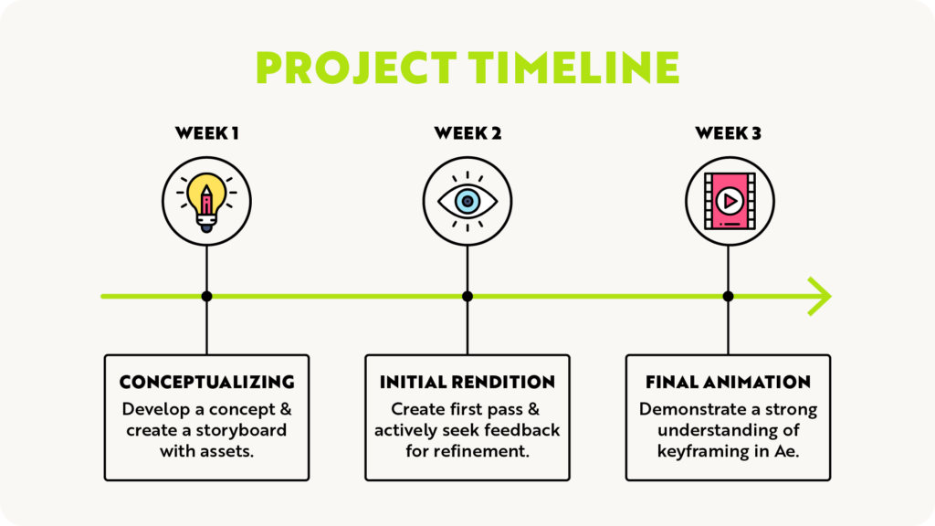
This timeline outlines the key phases of the project, defining the process from initial concept development to the final animation over a 3-week period.
The following section delves into the final design solution that was developed to meet the project goals and bring the diorama to life.
Design Solution
The final design solution was posted on the Neographic Media YouTube account:
The process of developing this diorama-style animation was broken down into key stages, each contributing to the project’s overall visual and narrative goals:
- Storyboarding: Establishing the narrative and visual flow.
- Creating Assets: Designing the individual components to establish the diorama’s style.
- Animating: Breathing life into the still visuals through keyframing and smooth transitions.
Each phase came with its own set of challenges and opportunities for creative refinement, explained in the following subsections.
Storyboarding
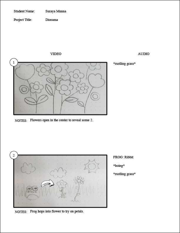
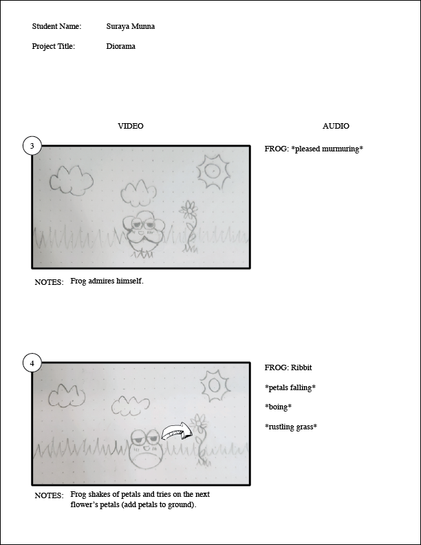
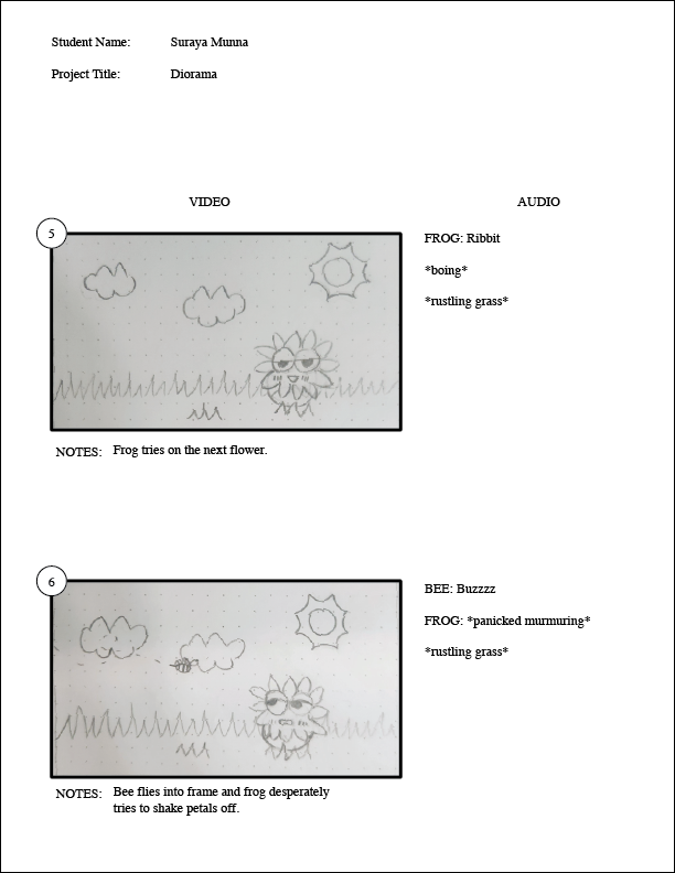
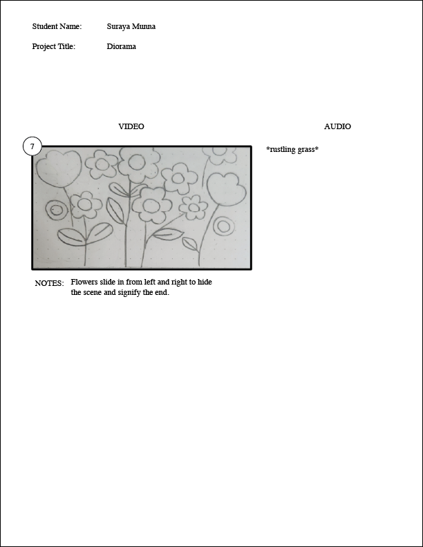
Throughout the design process, several elements evolved through iteration to enhance the final outcome. For example, adjustments to pacing led to the removal of certain audio cues that were initially planned, but ultimately disrupted the flow of the animation.
However, the storyboard effectively lays out the visual and narrative goals, particularly through creative choices like using flowers to open and close the scene, acting as the curtain that frames the animation. This decision adds to the whimsical tone and connects the beginning and end in a cohesive way.
Creating Assets



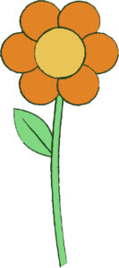
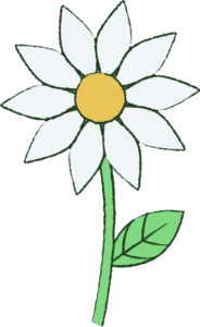
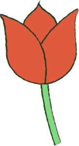
All visual assets were created and edited using Adobe Illustrator. To further connect the final animation to a real-life diorama, a pencil stroke style and roughen effect was applied to achieve a more hand-crafted, textured look.
A bright and cheery color palette was chosen to add a child-like touch, complementing the diorama theme. Overall, these intentional aesthetic choices helped reinforce the playful and whimsical nature of the final animation.
Animating
Achieving smooth animation required extensive keyframing and experimentation. The process involved thoughtful timing and transitions to ensure that static 2D graphics felt lively and dynamic. Each adjustment played a vital role in bringing the visuals to life.
The end result was an engaging animation with fluid motion graphics that enhanced the visual storytelling and successfully met the project’s creative goals.
Conclusions
This project ultimately served as a solid introduction into both the creative and technical aspects animation, offering valuable experience into the craft. The focus on smooth transitions and fluid animations required careful attention to timing and keyframing, ensuring that the motion remained natural and engaging. Additionally, the requirement to incorporate both visual and audio components enhanced the final product’s overall polish, reinforcing the importance of sound design in animation. Ultimately, this project not only reinforced animation skills but also emphasized the importance of utilizing both visual and auditorial elements to effectively engage viewers.
Like what you see?
Explore our blog page for additional case studies and projects that showcase impressive graphic design and visual storytelling.
